

Product User Experience and User Interface design


Streamlined Quote Search
The redesigned interface allows users to input all required details for a freight quote on a single screen. This eliminates the need for navigating through multiple pages, reducing user friction and enhancing efficiency.
Quote search, checkout and tracking
The redesigned search result page, showing different prices for the quotation with a detailed breakdown, varies according to the type of quote that is required (road/naval and aerial).
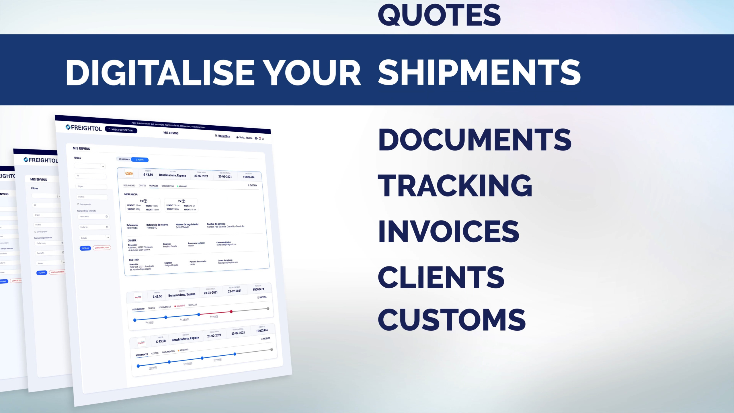
After a shipment has been fulfilled it’s possible to track it and access all the relative information and documentations via the dashboard


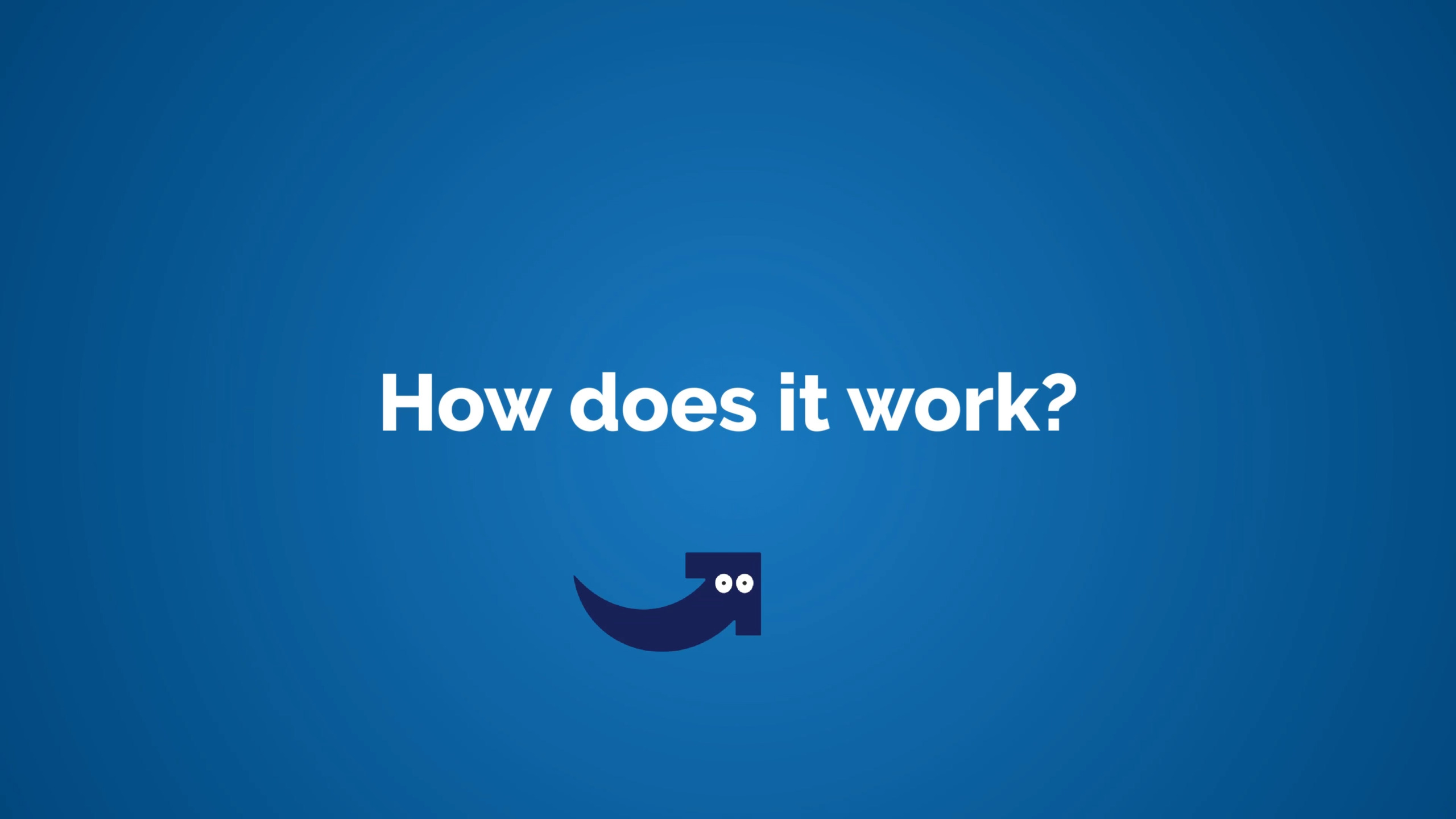
Explainer video
I produced this motion graphics animation to illustrate the platform’s features and it’s now featured on the company’s website as a means of showcasing their product. Throughout the video the brand’s mascot, a key element of the new brand I conceptualised, leads the viewer trough the user journey.
Branding

Proposals:
Approved design:
Eventually the company picked this version where the logo would be integrated in the letter G in the name, which became the symbol and also the arrow became the mascot of the platform, which has been used in social media promotions and in the product explainer video (see above)

Promotional Video
After finalising the new brand, I created this video as a crucial component for a marketing campaign. It has been used on social media platforms and during presentations with prospective clients and stakeholders.
Company's website
Lastly, I contributed to the company by aiding in the design of their website’s homepage and inner pages. I also played a pivotal role in enhancing the user experience for the registration process and the blog section:
Homepage

Registration page
")
Pricing page

Blog
